Before + After: Our Master Bathroom
I am BEYOND excited to finally share our revamped master bathroom with you all! Feels like I’ve been working on it forever, and I can genuinely say that after all these weeks, I love the outcome even more than I expected!
Just to backtrack, you may remember that I partnered with Floor & Decor on this project and got the chance to tour our local store last month.
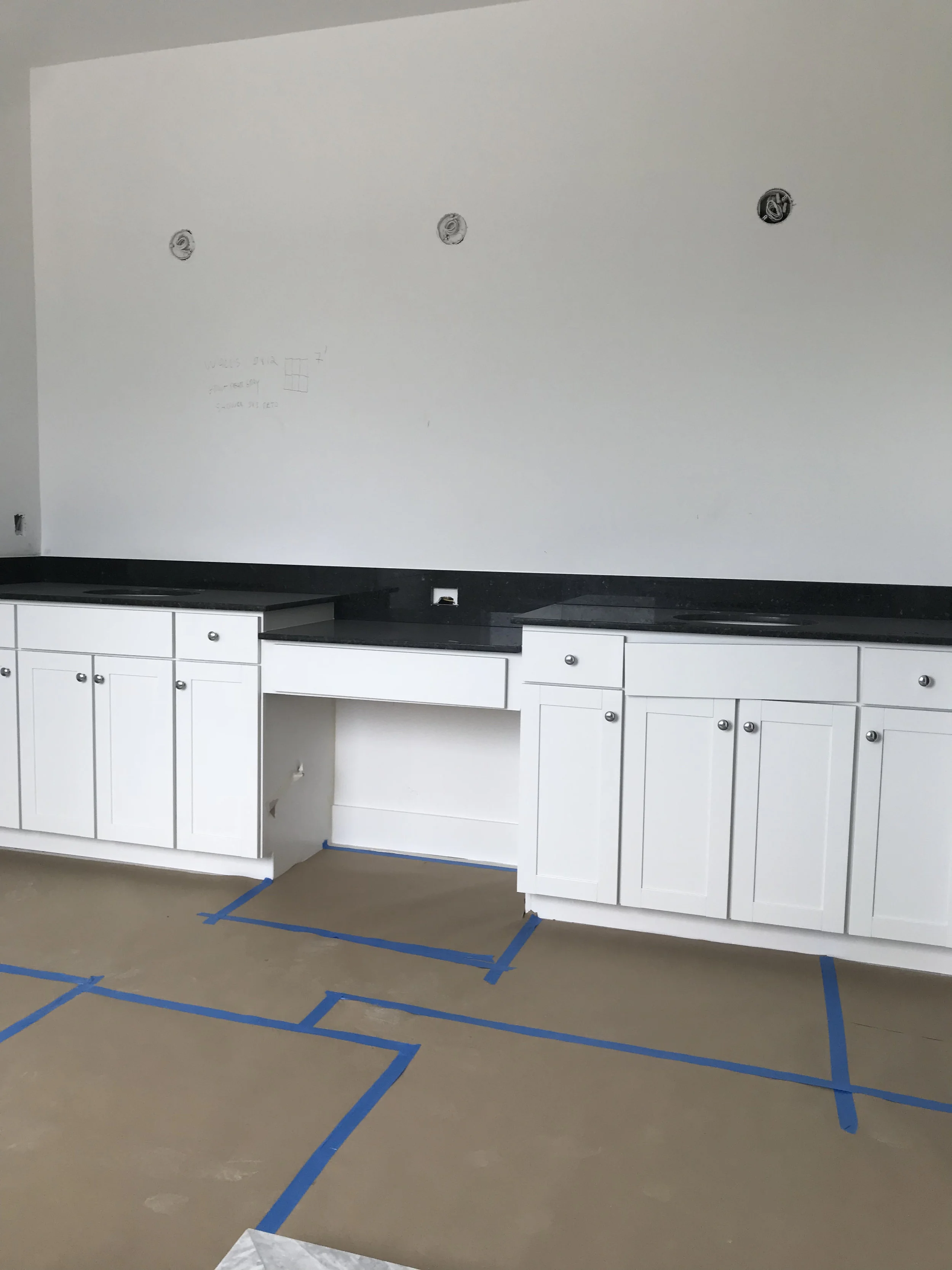
Floor & Decor has such a wide-variety of in-stock products at amazing deals, that following the tour, I had so many ideas floating through my head I could barely harness them! However, given time and budget (minor details!), I needed to choose a project that was manageable (especially since this was my first major home improvement project ever!) and felt our master bathroom was the most logical space to tackle. Plus, it was a relatively blank slate when we moved in — white shaker cabinets and neutral floors, basic builder grade lighting, hardware, glass enclosure, tile, granite countertop, and fixtures.
I could see the bathroom’s underlying potential immediately, but also knew we’d have to live with some of the bigger ticket items until a larger budget renovation was possible (i.e. shower enclosure, shower tile, and tub area). I even swapped out the cabinet hardware when we first moved in thinking it would make a difference…but really it was a small bandaid.
With an initial design plan that involved removing the builder grade mirror and sink faucets, patching up the subsequent holes, and eliminating the standard traditional brushed nickel sconces from the wall, this clean slate opened the door to a plethora of possibilities!
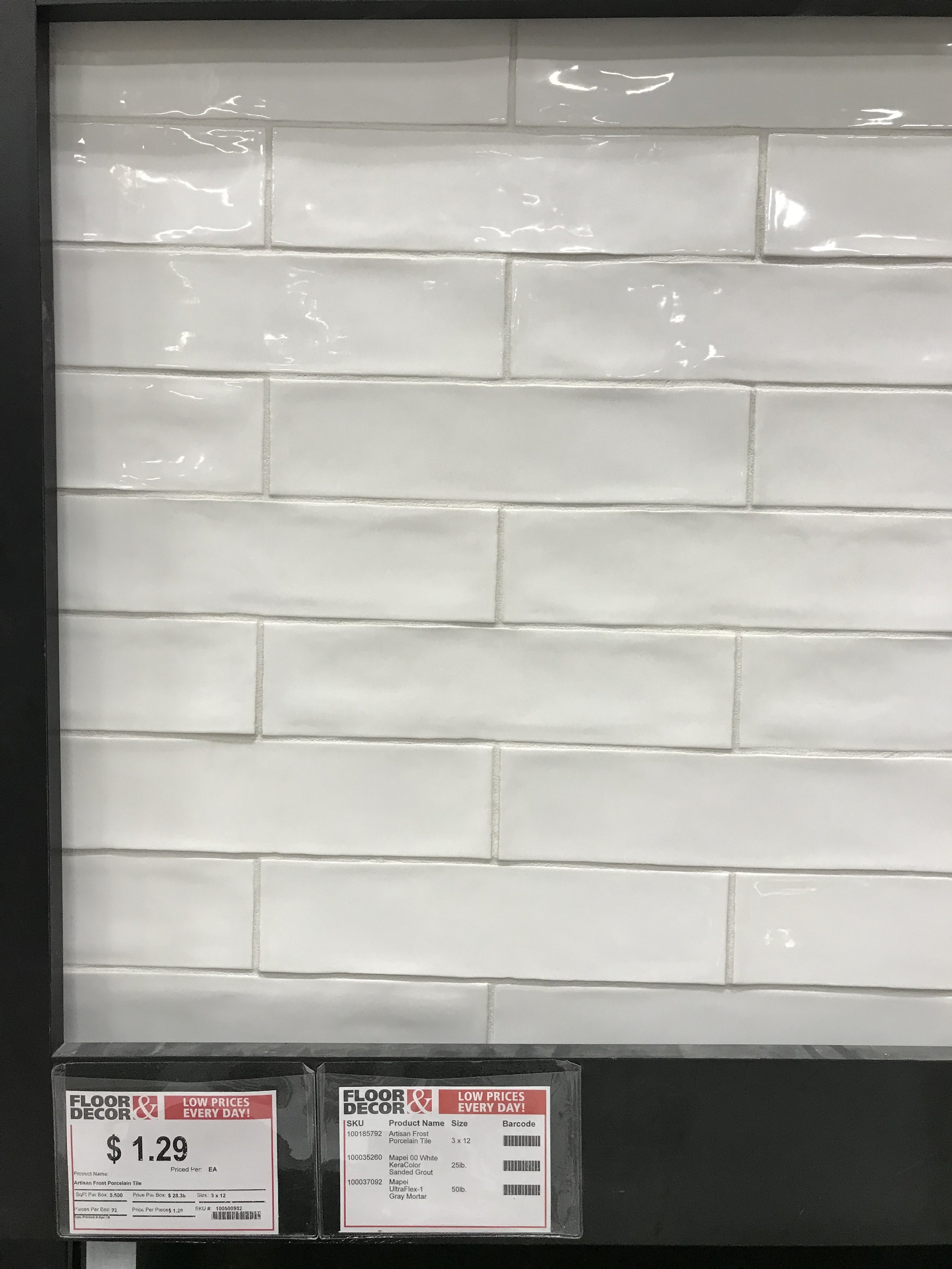
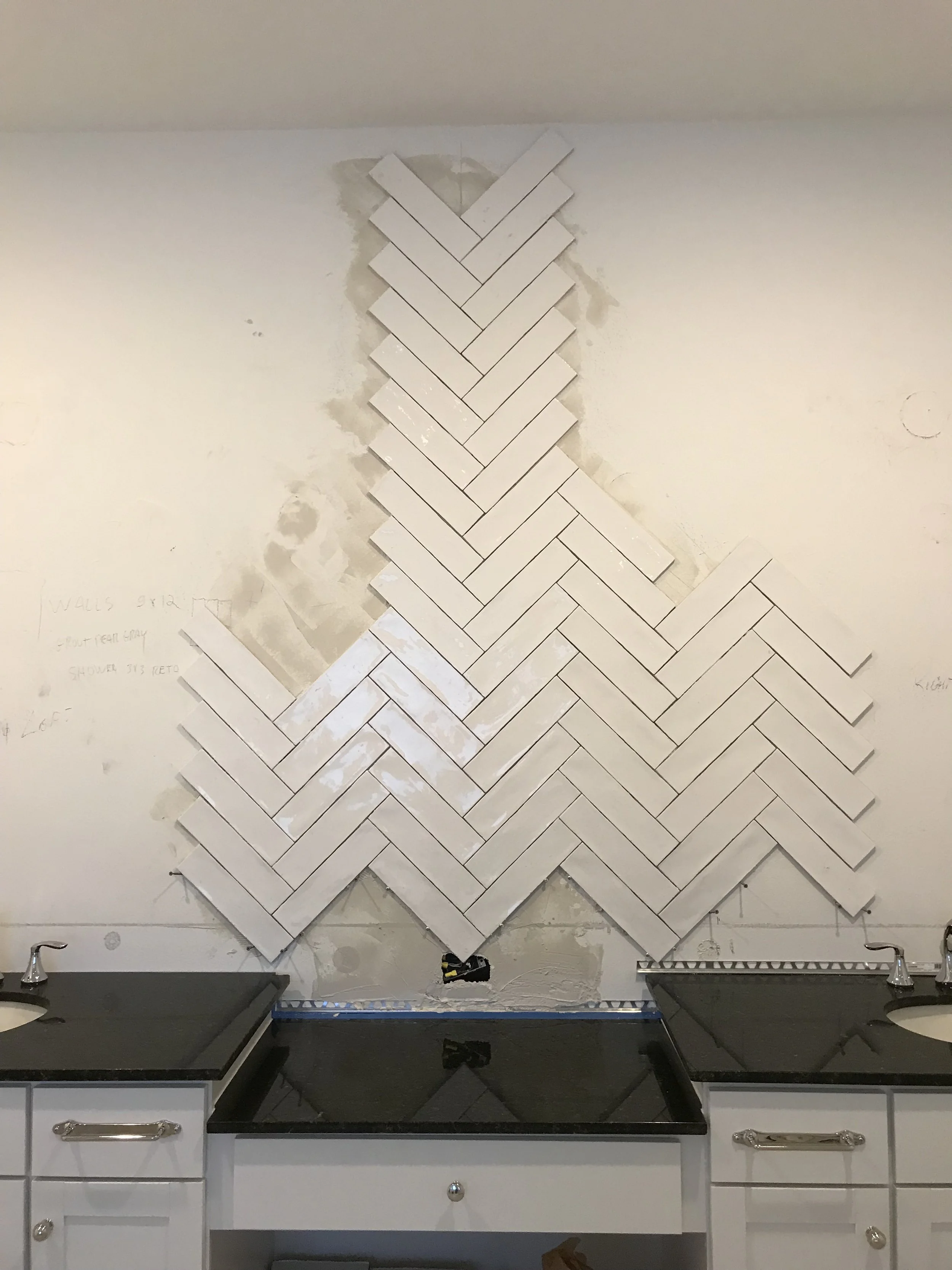
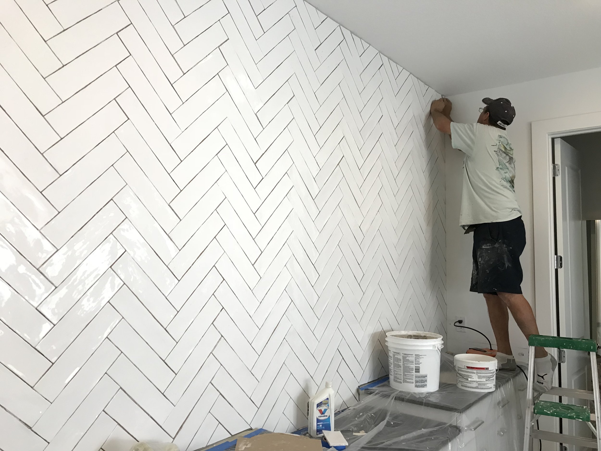
I had been eyeing Floor & Decor’s Villa Artisan frost porcelain tile in 3x12 for some time and decided our vanity wall was the ideal spot to install it in a herringbone pattern. It fit the beachy, organic vibe I was aiming for, and balanced out the shiny “newness” of our new construction digs perfectly. I also loved the juxtaposition of its high gloss, white porcelain subway tile classic look with its imperfect hammered, random texture.
I coupled the tile with Floor & Decor’s Mapei Ultracolor Plus grout in frost to create a subtle contrast and couldn’t love this pairing more. It’s actually my favorite grout color ever. Goes with everything, promise.
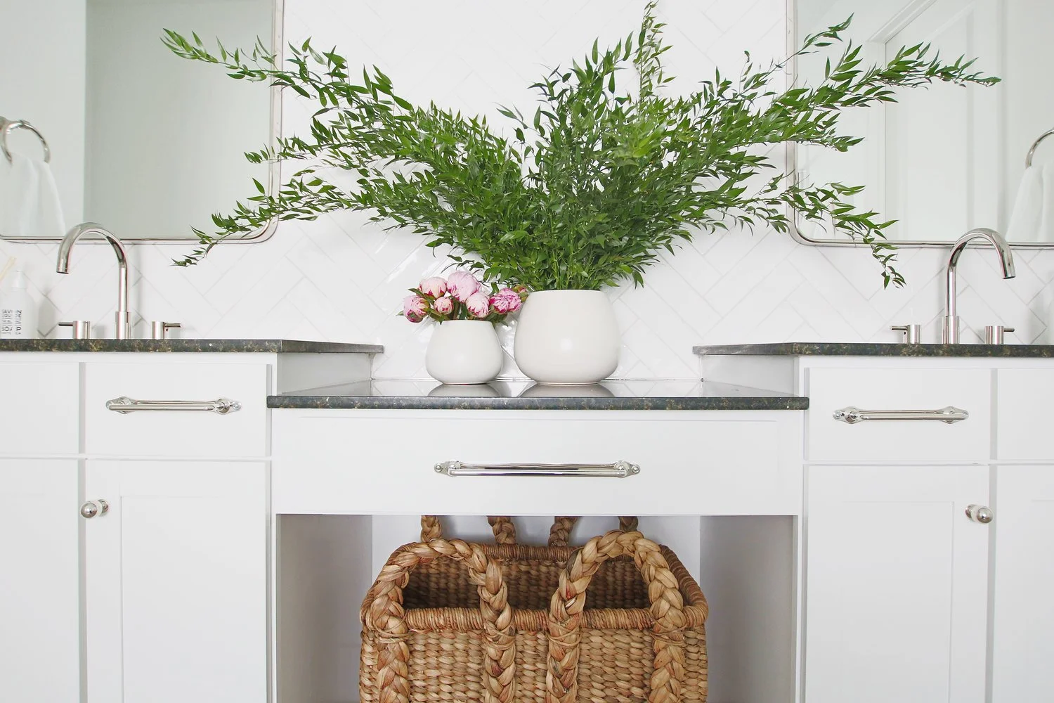
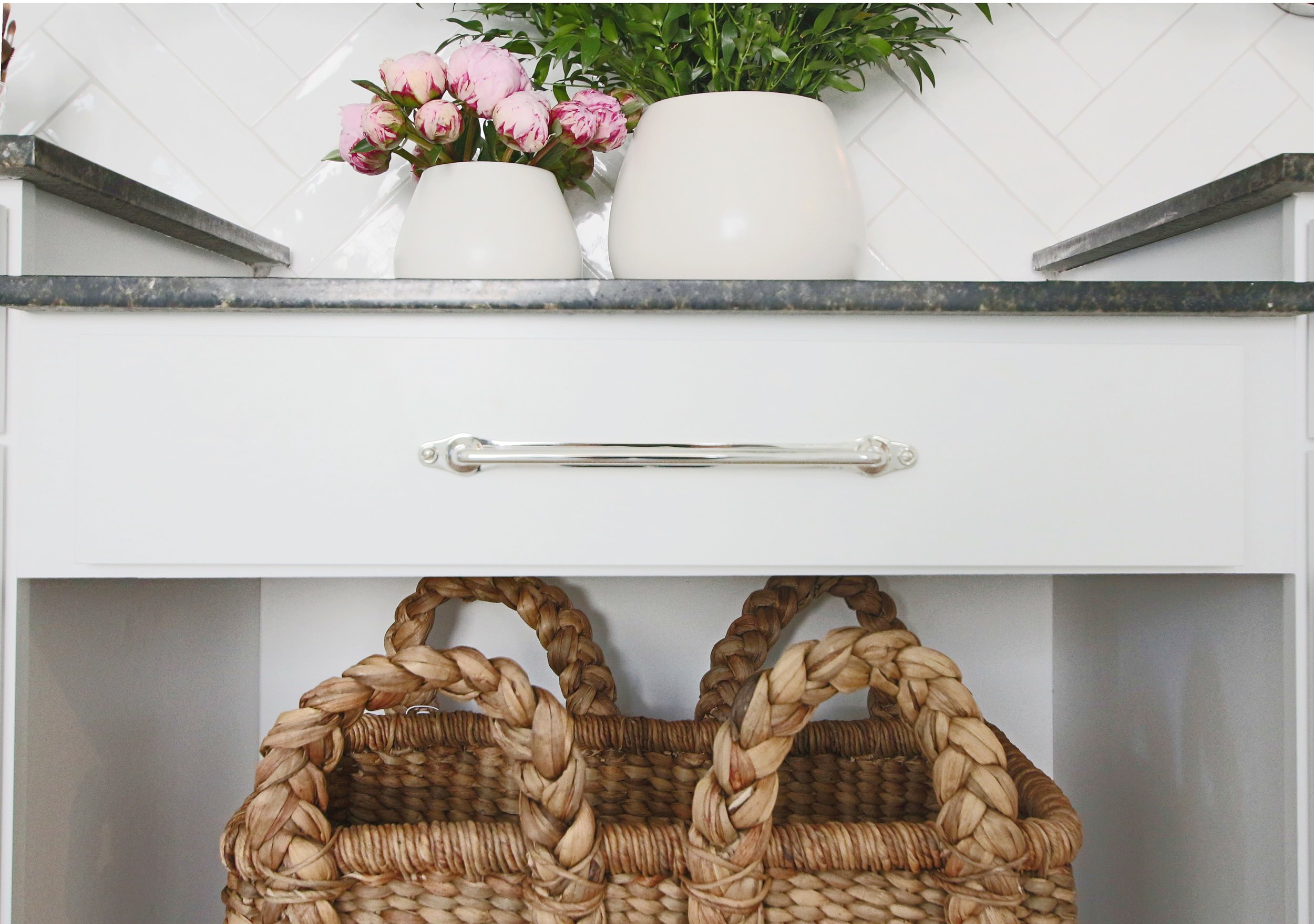
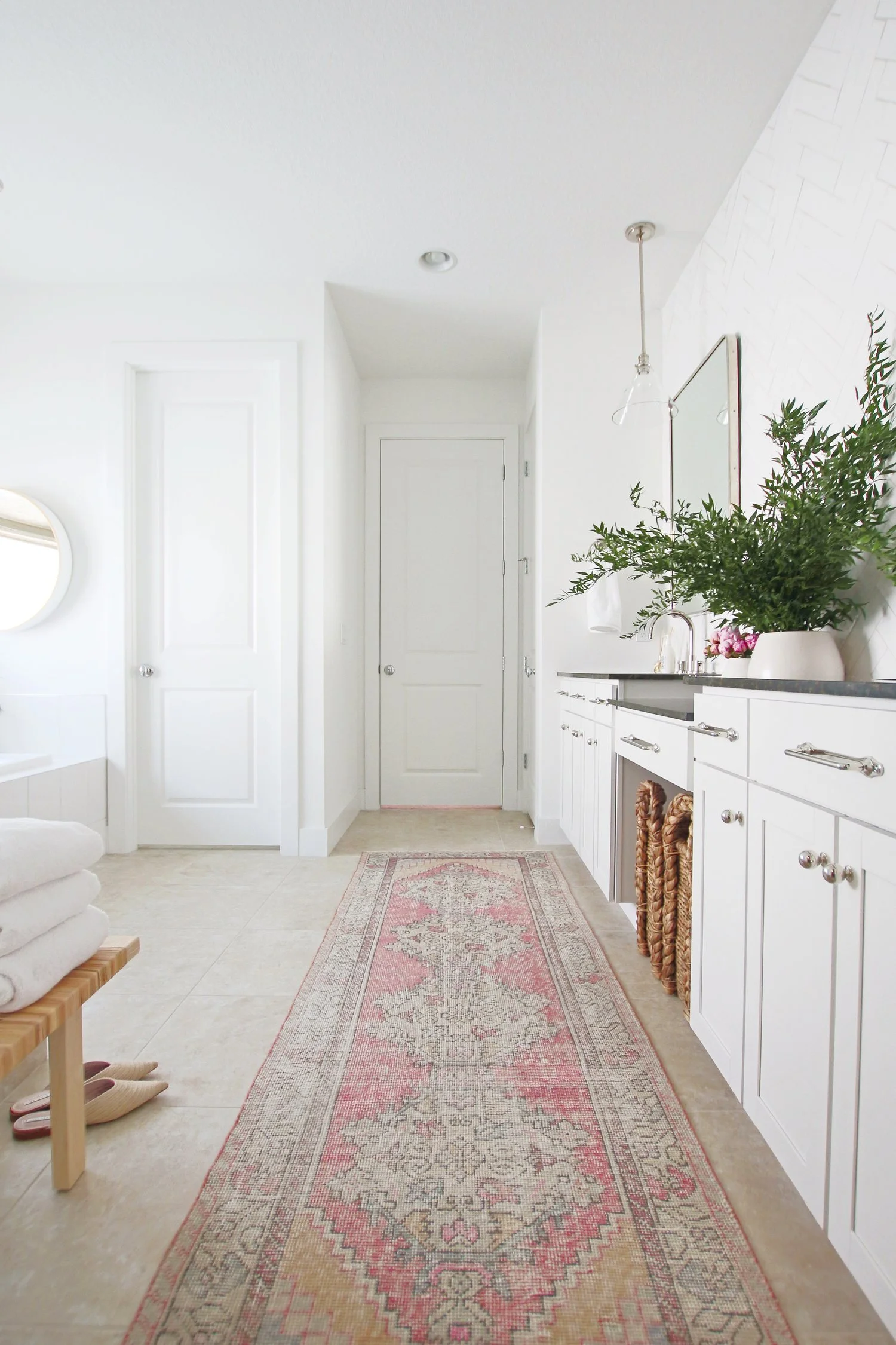
Once the tile installation was complete, large polished nickel mirrors and fixtures were added, along with glass pendant lights, a big woven seagrass laundry basket, and a stunning one-of-a-kind Turkish vintage runner. Fresh blooms and greenery were also a natural must!
I seriously cannot believe this space went from this…
To this!
I could not have chosen a more perfect tile for this wall and look forward to tackling the other side of the bathroom sometime next year!
This post is sponsored by Floor & Decor, a company I frequent, use, and love! Visit the Floor & Decor Inspiration Center for more ideas. Thank you for supporting this great sponsor!

