Milo's Bedroom Makeover Reveal
I’m so excited to finally be sharing Milo’s completed bedroom makeover with you all!
SHOP THE LOOK
To give a little context, we moved into our house a little over a year ago and moved all of Milo’s foundation pieces with us to his new room — his bed, dresser, rug, and desk. Any other superfluous design elements I dreamt about, like shiplapping walls or wallpapering, would just have to wait till the budget allowed.
***********
Fast forward to two months ago, when Milo asked me in the sweetest most serious voice, “when are you going to make my room feel more cozy like the other rooms?” — and my interior design loving self nearly crumbled from this self-perceived failure from my own son! I imagine this is the same way the cobbler felt when his shoeless children asked him why their feet were bare.
Anyway, I started to question his room. Is it sterile? Is it really not cozy to him? Is that why he prefers sleeping in his brother’s room?
Obviously giving our children exactly what they want when they want it isn’t our standard parenting motto, but I’d be lying if I didn’t say I was jumping with enthusiasm to fulfill this request. Girlfriend loves a home project! Plus, I couldn’t argue with the fact that his room, while light, bright, and airy, lacked a bit of warmth. In hindsight I can now see that it didn’t really feel complete.
As a reminder, here is what the room used to look like….
“THE BEFORE”
To most everyone in the world with two eyes this room is and was perfectly fine. Certainly not in dire straights, and I’m well aware its a very nice room for anyone. But since helping people love their homes is kinda my calling I knew a few minor changes would do wonders. And keep in mind that I promised myself and my husband that this would all be accomplished while staying within a modest budget.
***********
“THE NEW PLAN”
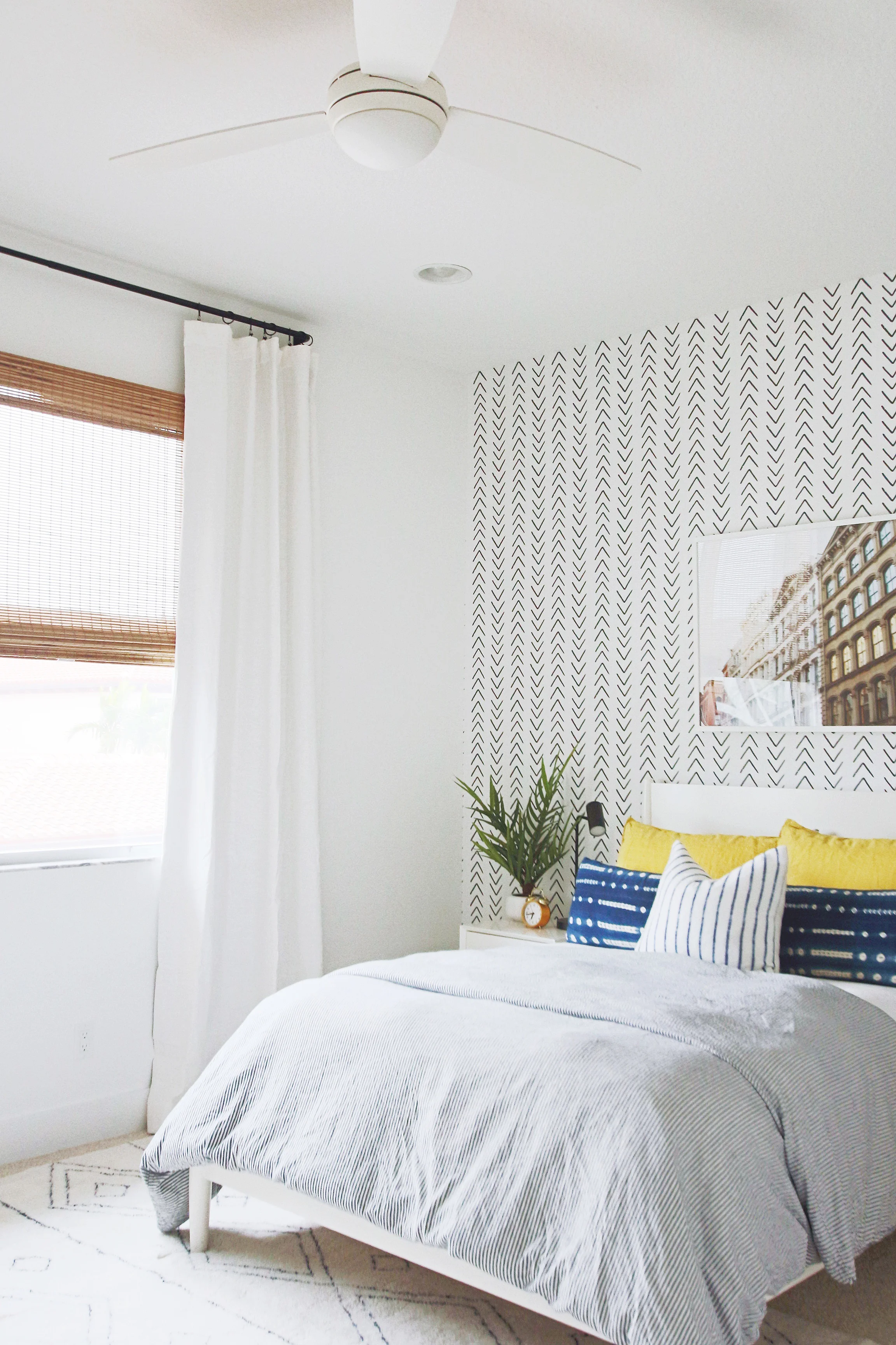
First thing was first, I had to remove the striped cordless roman shades I installed when we first moved in. They just weren’t working. I liked the look of them, but light peeked through the middle during the summer months and it was becoming a bit of an issue at bedtime. To replace it, I ordered a cordless natural woven roman shade for that organic texture the room desperately needed, layered under my favorite double-width white linen blackout curtains, and hung from my new favorite affordable curtain rod and rings.
[A good tip to remember when it comes to hanging curtains, always install them high and wide so the bottom of the panel just skims the ground. Repeat after me: HIGH AND WIDE! This creates the illusion of a larger space and makes a world of difference in any room. I promise.]
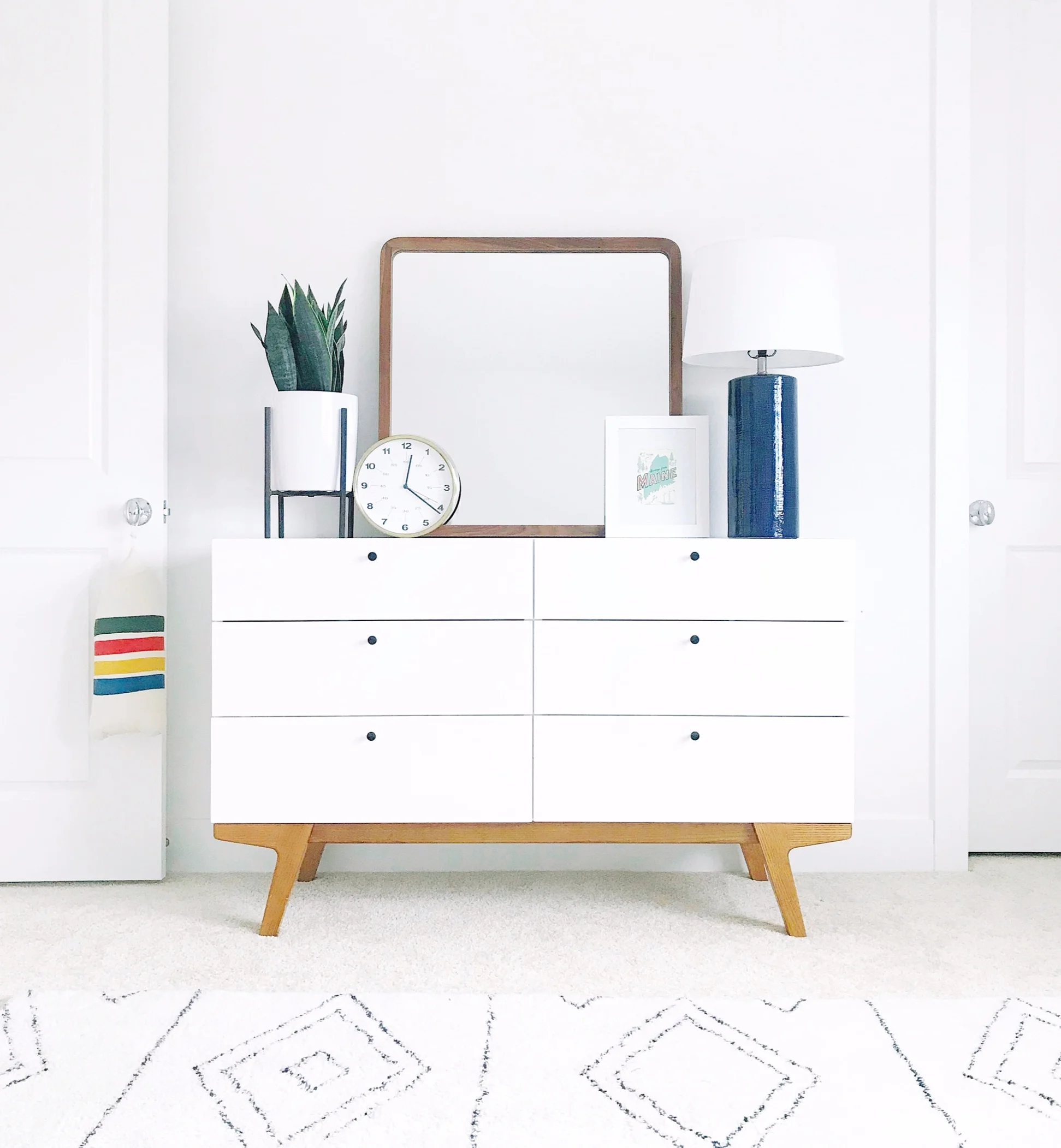
An oversized 48” mirror to hang above the dresser was also purchased, along with a metal based rattan desk chair, and a single white wood nightstand. All aesthetically pleasing yet super functional.
The icing on the cake was when, during one of my late night Pinterest scrolls, I came across a room with Livette Wallpaper’s Scandinavian Design Inspired Wallpaper. I stopped dead in my tracks because this print, which I had never seen before but had imagined in my head, was exactly what Milo’s room needed. Black and white, modern yet boho, and totally perfect. I had to have it!
***********
Upon further perusal of the beautiful Livette Wallpaper website I realized all of their wallpaper was available in removable or traditional backing and in a variety of dimensions. Ideal for any room, whether you own or rent, or like just like the option of not being fully committed to wallpaper forever.
I showed Milo the Scandinavian Design Inspired Wallpaper before ordering to make sure he approved, and not so surprisingly he loved it!
***********
Now that everything has arrived and been installed, this room is a new favorite in the house! The curtains, hung high and wide, add a soft layer of texture, the wallpaper adds a cool, cozy, modern pattern, and the oversized mirror reflects all the prettiness happening over on the headboard wall.
“THE AFTER”
It was a quick, easy, and affordable mini makeover to tackle, and we’re all happy because Milo is happy! And truly that is the most important component of any project. Knowing your child loves being in their room and sees it as a safe space to explore, be inspired, and dream big things is the best compliment for any parent, especially this design-loving momma!
SHOP THE LOOK
A big thanks to Livette’s Wallpaper for partnering with me on this project! It was a pleasure working with their cool team, and the quality and beauty of this paper speaks for itself!


