Leo's Bedroom Makeover Reveal
Our little Leo’s bedroom has slowly evolved into one of my favorite rooms in the house. Which, in full disclosure, wasn’t always the case!
“THE BEFORE”
It’s hard to gauge what bothered me more: the off center single window or the three different doors on three separate walls? This type of layout makes placing furniture annoying because there is typically only one way it’ll work…and you know me, I like to move ,y stuff around and around before deciding on proper placement!
Anyway, after plopping the bunk bed along the window wall, the dresser on the opposite wall, and his comfy chair in the only logical, and available, corner I paused on making any fun design decisions. Yes, this type of “writers block” even happens to designers!
“THE INSPIRATION”
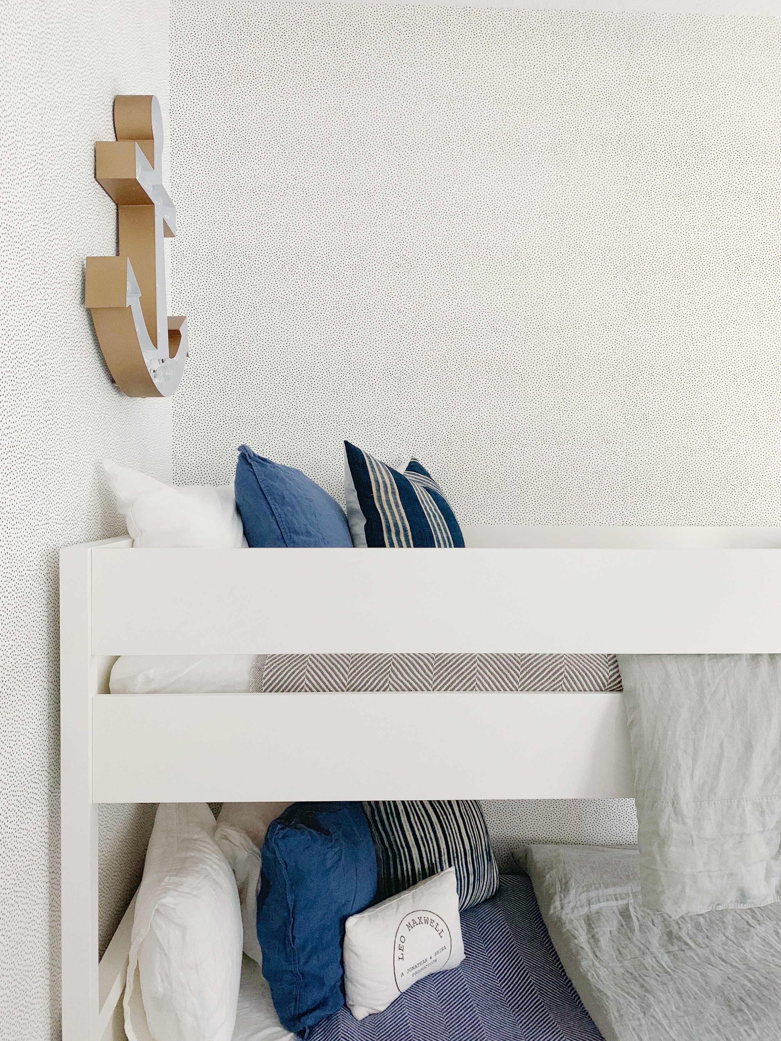
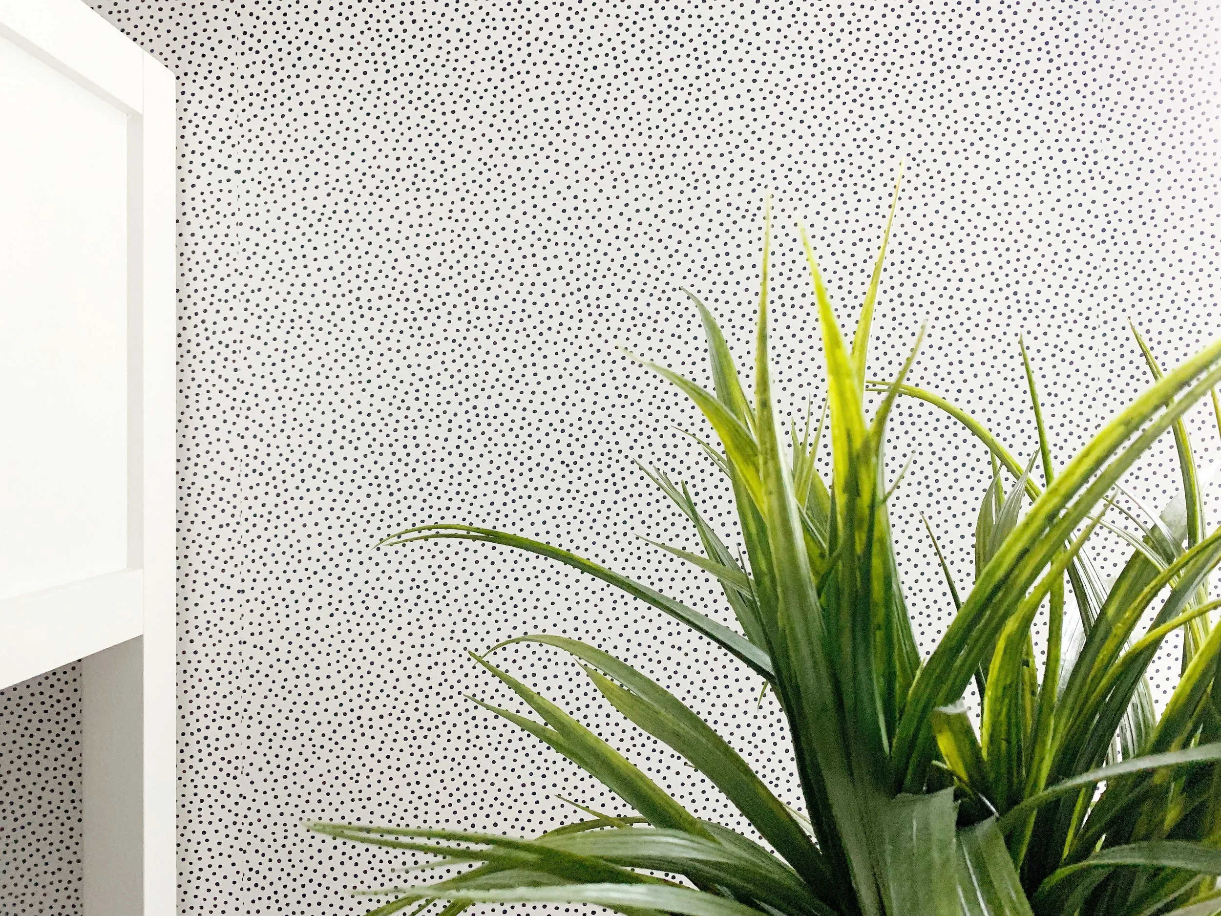
One day this past spring, while perusing wallpaper samples for a client project, I came across the Pebble by Sugar Paper wallpaper from Wallshoppe. I fell in love with the organic, imperfect polka dot print and felt drawn to the subtle texture of the pattern. In that moment I thought, “this would be the perfect addition to Leo’s room.”
Upon further research into the brand, I learned that Wallshoppe is all about creating spaces that are bright and happy, and spaces that aren’t taken too seriously. Hi, that’s my style too!
I loved finding out that Wallshoppe collaborates with cool artists and creatives to develop their unique wallpaper prints and produces all their wallpapers in the USA, printing in Los Angeles!
They offer removable AND traditional wallpaper too, so no matter where you live — whether you own or rent, or just change your mind up regularly and can’t commit for a lifetime — there is a Wallshoppe wallpaper for you.
While intrigued about the removable option, after consulting with my wallpaper guy, Jerry, we decided to go with the traditional backing. Primarily because Jerry’s most comfortable installing what he knows…and who am I to argue with his trusted expertise!?
“THE AFTER”
Once the wallpaper was installed, I immediately felt re-inspired to style this room as it deserved.
Since the furniture needed to stay in its original spot (remember, there wasn’t really any plausible relocation options), all I needed to do was hang a few pieces on the wall and style up the dresser, and voila, a more complete bedroom for Leo to enjoy!
How sweet did this little gallery wall turn out?
My favorite piece, and the shining star of this new arrangement, is clearly the shadowbox containing Leo’s first pair of baby shoes.
It was such an easy DIY and a fun piece of memorabilia to display. I highly recommend this shadowbox from Michael’s, although I’m sure you can find something similar at any local craft store.
I also added an oversized round wood mirror to above the dresser. This is a foolproof design decision, because 1) all bedrooms deserve one big mirror; 2) mirrors are a classic component that allow you to skip the stress of finding subjective artwork; 3) mirrors are a great way to bring in light and give the illusion of a larger space.
We’re all SO happy with how this room turned out — especially Leo! — and can’t wait to show you the quick and affordable updates we made to the boys’ shared Jack + Jill bathroom next! (Spoiler alert: there’s more awesome wallpaper!)


